8 Most Common Web Design Mistakes (How To Fix Them)
We all get how maddening a ropey website can be. You tap on a link, hoping to nip in and out with what you came for, and suddenly you’re bobbing about like a lost duck. It feels as if the person behind it never stopped to think about what you might need.
We’ve felt that frustration too; it’s not just bothersome—it turns folks away from websites.
A nugget of wisdom we stumbled upon is that dawdling load times are an absolute turn-off for users. They simply won’t hang about. So, we put our heads together to delve into this issue.
Our quest led us to unearth the top 8 most common web design blunders and sussed out how to set them right. This piece will walk you through these pitfalls and help you sort them head-on.
Brace yourself for some nifty fixes!
Key Takeaways
- Make menus clear and easy to use. This helps users find what they need quickly.
- Ensure your website looks good on mobile devices. Many people use their phones to browse the web.
- Speed up your website by using smaller images and cleaning up code. Slow websites push visitors away.
- Keep layouts simple. Too much information on one page makes it hard for users to focus.
Use consistent branding across your site with matching fonts, colours, and styles. This builds trust with visitors.
Poor Navigation
Ever landed on a website and felt like you were stuck in a maze? That’s poor navigation for you, making it tough to find what you’re after.
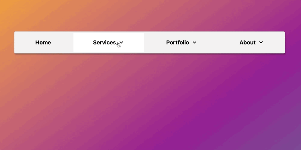
Lack of a clear menu structure
Menus that confuse are like maps without signs. We’ve seen sites where users feel lost, just trying to find basic information. A menu should guide visitors, not puzzle them. Our aim? To stop making websites a maze.
A clear menu is your visitor’s best friend on your website.
Confusing menus are common mistakes that hurt user experience. Think about mega menus crammed with links or pop-ups blocking the view. These can overwhelm and turn people away. Instead, we choose simplicity and clarity, making sure our site welcomes everyone who clicks in.
Unresponsive Design
If your website acts like a stubborn mule on mobile devices, you’re in hot water. Keep reading to learn how not to sink.
Failing to optimise for mobile devices
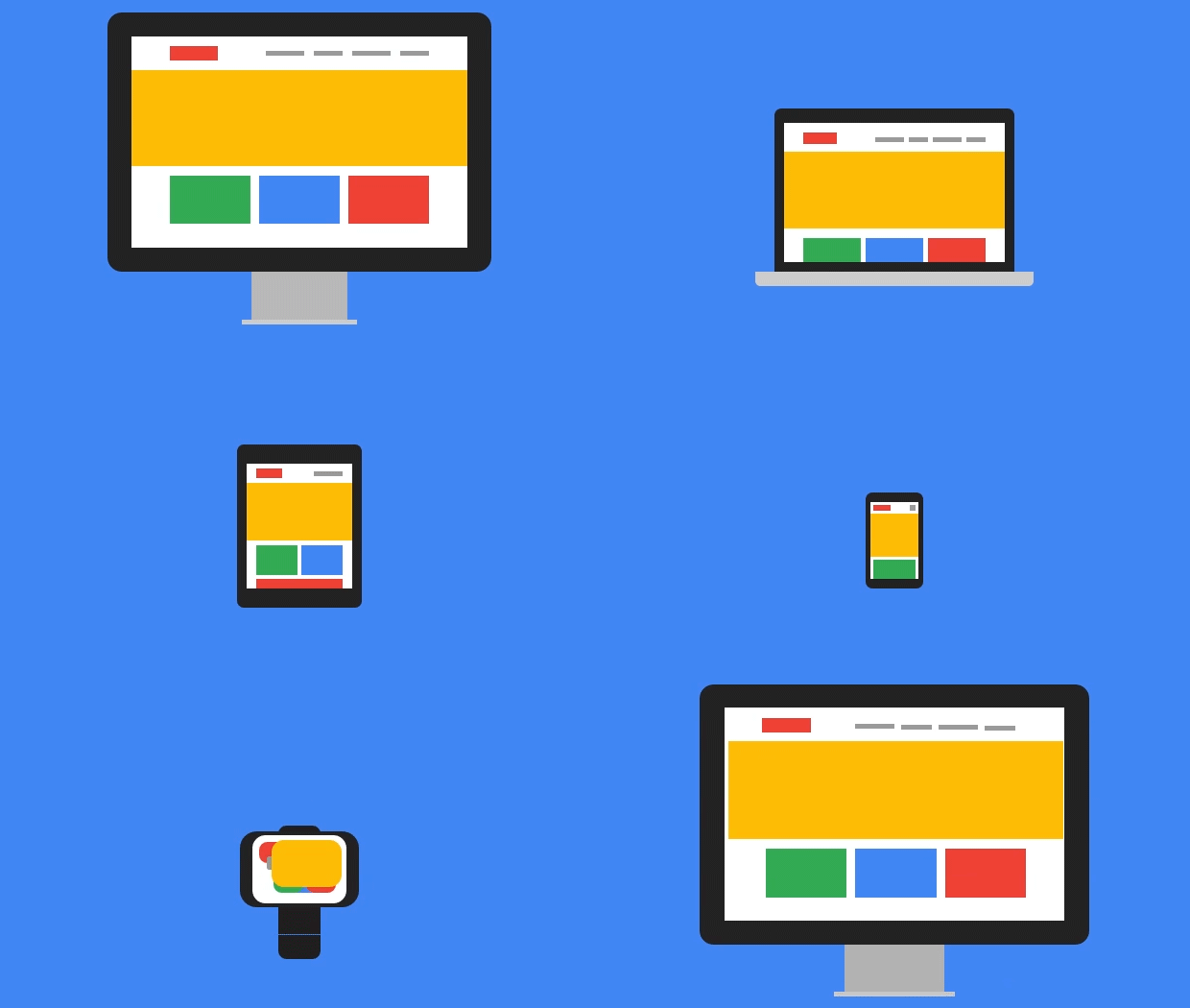
We’ve seen our fair share of websites that forget about mobile users. It’s a big mistake. A lot of people use their phones to go online these days. If your site doesn’t look good on a small screen, you’re in trouble.
We had to learn this the hard way. Once, we didn’t check how our site looked on mobiles and lost quite a few visitors because of it.
Fixing this isn’t rocket science, though. We started by testing our website on different devices. Then, we made sure everything worked well and looked sharp on any screen size. Images resized nicely, text was easy to read, and buttons were big enough to tap without fuss.
Trust us, paying attention to mobile users is worth every bit of effort you put into it.
Slow Loading Speeds
Waiting for a page to load is like watching paint dry, boring and frustrating. No one likes it when their time seems wasted by sluggish websites.
Oversized images and unoptimised code
Oversized images slow down websites. If a page takes too long to load, people might leave before they see anything. We need pictures that are big enough to look good but not so big they cause problems.
Also, code that’s not optimised makes things worse. Think of it like this: if a website were a car, unoptimised code would be like trying to drive with the handbrake on.
A smooth sea never made a skilled sailor.
We also fix bad code by cleaning it up and making sure everything runs fast and smoothly. This means getting rid of anything unnecessary that slows the site down. It’s all about making sure visitors can enjoy browsing without any hiccups or waiting around.
Cluttered Layouts
A messy layout can scare users away. Too much information on one page makes it hard to find what they need.
Overloading pages with too much information
Overloading pages with too much information makes them hard to use. Users can easily feel overwhelmed and confused by cluttered layouts. Slow loading times often happen because of large images or messy code, making visitors leave quickly.
We want our users to find what they need fast, without scrolling through endless details.
Clarity is key in web design. Too many words or images can hide important content. It’s better to have a clean layout that guides users smoothly through the site. A well-organised page helps everyone understand our message and navigate effortlessly.
Keeping things simple leads to a more enjoyable user experience, which is what we all aim for!
Inconsistent Branding
Inconsistent branding can confuse visitors. It leads to mismatched fonts, colours, and styles across your site. This makes it hard for users to recognise your brand. A clear and cohesive look builds trust.
Good branding keeps customers coming back! So, let’s fix this together by exploring how you can create a unified design that speaks loudly about your identity. Want to know more?
Mismatched fonts, colours, and styles
Mismatched fonts, colours, and styles can confuse visitors. We need a consistent look across the website. When elements clash, it distracts users from important content. This inconsistency creates frustration and makes our site seem unprofessional.
Using different fonts or colours in various sections can hurt user experience. A clear design helps visitors understand our message better. If they see a hodgepodge of styles, they might leave quickly.
We should always aim for visual harmony to keep users engaged on the page.
Ignoring Accessibility
Many websites forget to think about users with disabilities. This can make it hard for them to use the site, which isn’t fair or right.
Failing to accommodate users with disabilities
Ignoring accessibility can hurt our website’s user experience. Users with disabilities often struggle with poor designs. This mistake leaves out a significant audience who rely on accessible features.
Non-scannable text or hard-to-read elements make things worse. We miss chances to engage users when we don’t provide clear navigation or readable content.
Using PDF files for online reading is another pitfall. These can create barriers for some users, making it tough to access information on various devices. Confusing menus and messy layouts add to the frustration, leading visitors away from our site instead of guiding them smoothly through it.
Let’s fix these issues and welcome everyone!
Weak Call-to-Action (CTA) Buttons
Weak CTA buttons can confuse users. If they are unclear or hidden, we miss chances for engagement.
Unclear or poorly positioned CTAs
Unclear or poorly placed call-to-action (CTA) buttons can really hurt our website’s performance. If users can’t find what they need, they may leave quickly. Missing CTCs can lead to lost chances for engagement and sales.
We often see websites with small, hard-to-read buttons that blend into the background. This confusing design makes it tough for visitors to know where to click.
Having a clear CTA is key for guiding users toward what we want them to do next. It should stand out and be easy to understand. For example, instead of saying “Submit,” we could use “Get Your Free Guide!” This change gives users a reason to act.
Placement also matters—put CTAs where visitors expect them, like at the end of an article or on product pages. Our goal is to make user interaction smooth and straightforward!
Overuse of Pop-ups
Pop-ups can be annoying. They interrupt the flow of our website. Too many pop-ups make users want to leave fast. Let’s aim for a smoother experience instead! For more tips on design, keep reading with us!
Distracting users with excessive pop-ups
Excessive pop-ups can really annoy users. They block content and slow down browsing. We have all experienced this frustration at some point. Too many pop-ups create a cluttered feel on websites.
This can lead to confusion and disengagement from our visitors.
Pop-ups often interrupt the flow of information as well. Users may miss important details while trying to close these distractions. Moreover, we risk losing potential customers if they find our site overwhelming or hard to use.
Focusing on clear communication in design can help us avoid this pitfall and make everyone’s experience much better.
Neglecting SEO Practices
Neglecting SEO practices is a big mistake. Missing meta tags and alt text can make it hard for search engines to find your site.
Missing meta tags and alt text
Meta tags and alt text are often missed in web design. This mistake can hurt our website’s visibility. Meta tags help search engines understand what our site is about. Without them, we might fall behind in search results.
Alt text describes images for users who can’t see them. It also improves SEO by providing context to search engines.
Failing to include these elements leads to poor user engagement. Missing out on potential visitors can impact our site’s success significantly. Addressing this issue should be a priority for us as we strive for better design practices.
Next, let’s explore how ignoring accessibility can affect user experience on our websites.
How to Fix These Common Mistakes
Let’s take a look at simple fixes for these common web design blunders. With the right tools and easy tips, we can make our websites better for everyone who visits them.
Practical tips and tools to improve design
Improving web design is easier than it sounds. We can use simple tools to help us out. For instance, using a service like Google PageSpeed Insights helps spot slow loading speeds. It will tell us where oversized images or bad code are hiding.
Clean designs attract users. Tools like Canva let us create clear graphics without fuss. We should also focus on user flow with our menu structures, keeping them easy to follow. Testing on mobile devices is key too since many users visit websites from their phones.
Applying these tips lessens common mistakes in website design and boosts user experience as well!
Conclusion
We’ve covered some common web design blunders. Challenging navigation, unresponsive design, and slow loading speeds can hurt user experience. Busy layouts and inconsistent branding leave users puzzled.
We need to pay attention to accessibility too. Simple fixes can lead to a smoother, more engaging site.
Keep in mind, applying these tips can significantly improve your website’s performance. For those wanting additional help, there are plenty of resources available! Let’s take action today.
A better website awaits us all!
